On the day my company, Bottle Rocket, decided to have everyone work remotely, I found out I would be taking-on a new client and Discovery would need to take place within about a week.
Crap!
Not only had we just found out we’d be working from home until further notice, I was faced with planning a completely remote Discovery session without all the comfortable elements that helped us earn our reputation. At first, I couldn’t even imagine what that would look like. Discovery is a process I love because of the opportunity to build trust with a new client, and we help the team gain new perspectives about their customers and what they care about. As a company we’ve developed a method that relies heavily on people being physically in the same room. It involves lively discussions, whiteboarding, impromptu sketching, serious listening, and eating together (never underestimate the value of breaking bread with your clients). Now I needed to pull all of this off, essentially over the phone.
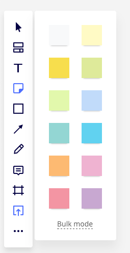
Fortunately, I wasn’t alone. Several people from different disciplines joined in to create a “Remote Discovery Team” to help define a new “digital” process. First, I created an agenda for each activity which I sent to the team for perspective. Then, I made a recommendation to use Miro — a digital whiteboard with tools to create different deliverables like mind maps using interactive sticky notes. In an attempt to keep an organic feel to some of the exercises, I also proposed using my document camera and a small whiteboard so that I could sketch live when we made lists or drew-out pictures for journey maps. For communication, we chose Zoom; our existing teleworking platform. As a team, we spent as many days as we could preparing and refining not only the exercises we had planned but rehearsing our roles within them; who would lead which exercise, how would hand-offs work, how would we interlace the different technologies smoothly and get past our own learning-curves with things like Miro.
Let me describe how we orchestrated the two-day session.
DAY 1 — FOCUS & PERSONAE
Our first exercise would introduce everyone to each other beginning with name, title, project role, and a single phrase to tell us what success will look like for this project. In the physical space, I would normally just list the phrases on the whiteboard as they come, but we realized this was a chance to train the participants to use Miro. They would need to select a sticky note, fill it out, and place it on a board. It was important to break-down that simple act into components, so sequence became important. We decided we’d get everyone to introduce themselves as the first step, then place the stickies all at once as the second step. The third step would be reading the stickies aloud, to understand the different perspectives in the room. By doing it this way, we were preparing the team for a more complex exercise to come. Just like a platform game, the first level or two is designed to show you how to play the game. This turns out to be more effective than just explaining with a tutorial or static instruction. The preparation to this point taught me two things:

Learning #1: The more you try to match the real world, the more complicated you make things. In deconstructing the first sticky exercise, I saw that I was making too many assumptions about what people would understand. I learned we needed to design the activity around learning the software, and not try to mirror a room full of people sitting together.
Learning #2: This is still asynchronous communication. It moves quickly, but the technology dictates that the activity must unfold one person at a time. I learned that even though the breaks between communications are short, the system wouldn’t support the kind of rapid-fire activity that comes with physical proximity.
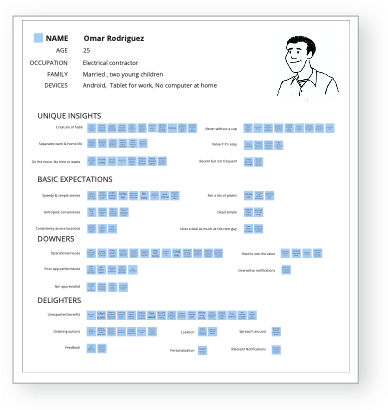
The next exercise was the creation of quick personae to give us a more tangible picture of “the User” within the context of the app we’re designing. Ideally, personae are data-driven from information gathered through usability testing with some kind of contextual inquiry or interviews. In the past, we would use large flipcharts to capture the details for each person we’re trying to describe. Again, to convert a lo-fi, hands-on exercise to a digital format, we used Miro to create a template for each persona and pre-populated each with the basic information and a quick portrait sketch.

The purpose of this exercise is to characterize the people (end users) who would be using the application. We noted a few demographic details: a real name (not “Sally Shopper”); their age; family status; and what technology they use. We then listed any other unique insights that would give us a glimpse into the world they live in. Next we made three lists. The first list considered the persona’s basic expectations. We asked, “what are the table stakes for an app like this?”
The second list asked “what could potentially really disappoint the persona in this sort of app?” The third list asked “what could make the persona really happy about this app?” We focused as an entire group on each persona and used sticky notes to fill-in the lists. I read them to the group as they were posted until we’d broadly filled out information for three personae with input from the group. This part is not a long exercise because of what follows. That evening, I clustered the sticky-notes based on their similarities and used a short phrase to characterize each cluster. This made each persona more referenceable for the next day’s exercise.
DAY 2 — EMPATHY/JOURNEY MAPS & APP MISSION STATEMENT
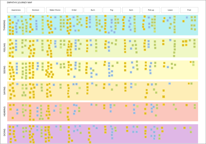
The following day, we created a combination of a journey map and an Empathy map. It is a diagram with steps in a process across the top and down the left-hand side, a list of senses and actions the user might experience during those tasks. The exercise took us through the things a person using the app will encounter before, during, and after their experience. While capturing touchpoints and their likely emotional state, it also captures what they perceive through their different senses and what they might be thinking. It’s a deeper way to inhabit the world of a person and ultimately helps the participants separate the persona in their mind from themselves (everyone’s default “user”). To do this we had a grid set-up in Miro and as we took each persona though the journey, we used sticky notes to say what they might be thinking, feeling, or doing at that moment.

It turned out that taking our time with the first exercise paid dividends. By this point everyone was thinking about the user rather than how to open and place a sticky note.
To move the session along, we created Zoom rooms so we could divide into teams and work separately. Each team took ownership of one of the personas answering questions from that customer’s point of view. For example: “During checkout, what is Susan thinking about?” or “Between placing an order and receiving his food, what was Omar feeling in that moment?” While they completed the grid for an individual persona, they were posting stickies on the same board which was a little chaotic, but it worked. I was able to drop-into each Zoom room to see how the teams were doing and answer any questions about the exercise or their persona.
The final exercise was to collect the terms that we would use to craft an app mission statement. Rather than dust-off an existing corporate mission statement, we created one just for the project. This is a standard Bottle Rocket practice that we adhere to for each new app build we work towards. It gives everyone involved a north star to revisit and keep top of mind throughout all decisions. To do this, we made two lists using the document camera. The first list contained the different adjectives one might use to describe the finished project. The second list asked for emotions that might be felt when the application is used. I would later use some of these terms along with the success statements from the first exercise to craft the mission statement. Doing it this way is much more efficient than trying to word-craft in a room full of 12+ people. By writing it myself I can work with key stakeholders to refine it later.
To wind up the sessions, we explained how this Discovery work will inform the ongoing project, and then discussed the next steps to begin designing the interface. Obviously, there would be further meetings about user stories and how the capabilities of the app will support the business, but these exercises often reveal reasons to downplay or eliminate certain features while creating or emphasizing others. Without Discovery we can’t really know if we are solving a problem for the people who will use the app.
More learnings I picked up along the way:
Learning #3: You can only expect so much participation in a day. Fortunately, we determined that a full day in front of the computer would be too much of a beat-down for everyone, so we divided the session into two segments, four hours each, over two days.
Learning #4: There is still a lot of homework for the moderator; just a different kind. I had to spend a fair amount of time before we could continue and after sessions for review. I had to make sense out of the clusters of sticky-notes and characterize the groups before we could continue.
POST DISCOVERY
That evening I extended the data in the Empathy/Journey Maps to capture the emotional state of the users at each point in the task flow and connected the points to show the ebb and flow across the tasks.

It was critical to distill the data we compiled into artifacts to help us remember the key attributes of the experience through the eyes of our personae. I created Journey Maps by first downloading all the sticky-notes to a spreadsheet. The spreadsheet let me see how similar observations rolled-up into key phases of the experience. I translated them into a set of illustrated pathways with different characteristics. This deliverable was also posted to the Miro board which now stands as a record of our activities. Later that week, we came back together to review our work.

SO, HOW DID IT GO?
The team regrouped a couple of days later to review our efforts and review the deliverables that emerged. The “Success Is..” exercise, the development of separate personae, the deep-dive using the Empathy/Journey map, the app mission statement, the emotional graph, and the illustrated user journeys together gave us a picture of the users and their different experiences from various perspectives. We also canvassed the team for feedback about what they thought was successful about our sessions and gather feedback on what needed work.
Comparing this effort to our usual method, there were some things we missed that come with being face-to-face in a room together like general spontaneity — everything had to be planned more prescriptively. Being remote eliminates cues from facial expression and body-language that help you pace the meetings or shift focus. You lose the ability to step into a hallway for a quick sidebar that leads to a course correction even though there were ways to communicate in the background. Pivoting in this environment would be much harder.
On the other hand, the nature of the environment created in Zoom made it easier to hear and understand people speaking and I think there was a leveling effect that encouraged people to speak-up. We can now consider alternatives to requiring everyone to be in the same physical space when sometimes, that just isn’t possible. When we emerge to a time when social distancing can be safely relaxed, some of these techniques will become fixtures in our future approach.
Ultimately, the effort was successful in that the client was highly engaged, understood the purpose of each exercise, and valued the time we spent together on this process. The ultimate testament is the client is pleased and we’ve learned so much about our client and their end users to inform the design and development process going forward.
In summary, I would say this process was successful at replicating some of the human-to-human interaction that makes Bottle RocketBottle Rocket. This process is definitely not a script for all future Discovery sessions, but rather an attempt at trying something new given our new circumstances in an effort to maintain as much of our Bottle Rocket norms as possible. We were able to create an atmosphere focused on great outcomes rather than simply executing on a pre-determined list of features and functions, even while all working remotely. This is just one of the many tools we have at our disposal to better understand our clients, their customers, and ourselves a little better. We’re definitely not the first company to face this challenge, but hopefully this process and our learnings can help you if and when you are presented with a similar challenge. On to the next!
P.S. If you were curious about all of the technology used to make this possible, see below.
My rig:
- Laptop — 2017 13” MacBook
- Monitor — Dell 27”
- Camera — Unzano HF2 Streaming Webcam (USB)
- Microphone — Samson Meteor Mic (USB)
- Document Camera — IPEVO V4K Ultra High Definition (USB)
- Whiteboard — 9 x 12 laptop whiteboard
- Markers — Steadtler Lumocolor Correctable
Software:
- Zoom for communication
- Miro for a digital whiteboard
- Slack for back-channel communication

