Widening our Focus
At Google I/O 2022 there was a strong focus on the larger Android ecosystem and not just improvements to the mobile phone experience. With new hardware products in the tablet, smart watch, and glasses markets, Google is showing that their focus is on creating a user experience that surrounds us, puts us in the center of, and in control of all our technology. This is being backed by Google’s strong presence in AI and enabled by more powerful development tools, such as Jetpack Compose.
In this blog series we will cover how to leverage these tools to create a unified UX across the entire ecosystem while saving time and money.
Tablets First
With tablet and foldable devices becoming more popular this is the logical place to start our series. Large screens provide an opportunity for mobile applications to provide a customized experience for the user and to distinguish themselves from the competition. However, in an ever-competitive market where cost and delivery time is of utmost importance, how do we deliver this value without increasing costs?
Jetpack Compose to the Rescue
Besides being Android’s newest user interface coding paradigm, Compose has a focus on re-usability. Every UI widget is made of composables and can be used by other composables. It is this nature of composition that enables the developer to create components that can be used to deliver value without increasing effort.
In that vein, we will be covering several Compose based solutions for common large screen design patterns:
- List Detail
- News Feed
- Map/Location List
Animated List Detail
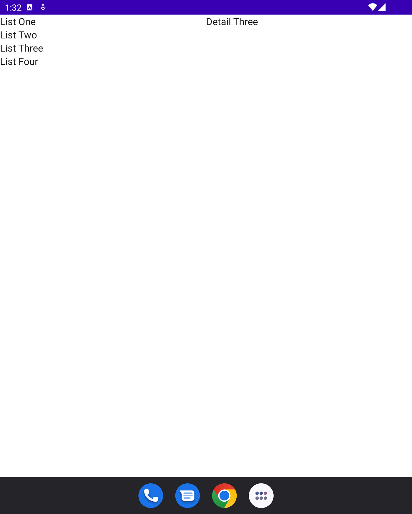
The List Detail pattern is a common design pattern where a list of items is displayed on one pane of a screen and, when an item it selected, its detail is shown on the other pane. On a standard mobile device these panes are presented as separate screens and, on a tablet, they are presented side by side on a single screen.
Using Animated List Detail
In order to demo our list detail view, first we will need to create an activity.
class MainActivity : ComponentActivity() {
    @OptIn(ExperimentalMaterial3WindowSizeClassApi::class)
    override fun onCreate(savedInstanceState: Bundle?) {
        super.onCreate(savedInstanceState)
        setContent {
            ListDetailBlogTheme {
                Surface(
                    modifier = Modifier.fillMaxSize(),
                    color = MaterialTheme.colors.background
                ) {
                    Content(calculateWindowSizeClass(this).widthSizeClass)
                }
            }
        }
    }
}
Here we are using our default theme, grabbing the current WindowSizeClass, and passing it to our content function.
@Composable
fun Content(widthSizeClass: WindowWidthSizeClass) {
    Column(modifier = Modifier.fillMaxSize()) {
        AnimatedListDetail(
            list = data,
            compactWidth = widthSizeClass == WindowWidthSizeClass.Compact
        ) {
            List {
                LazyColumn {
                    items(it) {
                        Text(text = "List $it",
                            Modifier.clickable(true) { select(it) }
                        )
                    }
                }
            }
            Detail {
                it?.let { Text("Detail $it") }
            }
        }
    }
}
Our content function creates a column as a placeholder, adds the Animated List Detail widget, and defines a simple List and Detail view.
Looking Inside the Code
From here in, we’ll be getting technical and showing how the AnimatedListDetail composable was built. If you’re more interested in using the widget and not creating from scratch or modifying, you may jump ahead to the section on LaunchPad Compose (Bottle Rockets open-source library of ready to use Compose Components)
The Scope
From the above code, we saw how a developer could use the composable and scope to create a List Detail view within their app. Now we can look at a quick breakdown of how the scope functions.
/**
 * List detail scope - This scope is used by [AnimatedListDetail] to pass in definitions for List and Detail Composable UI
 * **Note** This follows same pattern as [LazyListScope]
 *
 * @param T - Type of item used in list and detail
 */
@Immutable
interface ListDetailScope<T> {
    val list: @Composable (List<T>) -> Unit
    val detail: @Composable (T?) -> Unit
    val detailStateCallback: (Boolean) -> Unit
    val selector: MutableSharedFlow<String?>

    @Composable
    fun List(newList: @Composable (List<T>) -> Unit)

    @Composable
    fun Detail(newDetail: @Composable (T?) -> Unit)

    @Composable
    fun DetailState(newDetailState: (Boolean) -> Unit)

    fun select(key: String?)
}
ListDetailScope is a templated interface that allows for the ListDetail view to handle complex UI models. This is necessary so your list view can display more than just a simple String. The List function allows the developer to define a composable block that accepts a list of items in order to create the List UI. The Detail function allows the develop to define a code block that accepts an item in order to create the Detail UI. DetailState is a callback that can deliver back the state of detail pane so that parent UI can adjust navigation behavior and other UI components. The select function allows for code inside the List/Detail blocks to select an item by its key value.
The UI
There are 2 UI pieces used to display the list and detail.
Single View
// UI for showing one screen at a time@Composablefun ListDetailScopeImpl<T>.singleScreen(selected: T?) {Box(modifier = Modifier.fillMaxSize()) {// Show detail if item is selectedselected?.also {detail(it)} ?: run {// Otherwise, show listlist(items)}}}
Side by Side View
// UI for large screens, display both list and detail@Composablefun ListDetailScopeImpl<T>.sideBySideScreens(selected: T?) {Row(Modifier.fillMaxWidth()) {Box(modifier = Modifier.weight(1f)) {list(items)}Box(modifier = Modifier.weight(1f)) {detail(selected)}}}
The Composable
The AnimatedListDetail composable puts everything together so the developer doesn’t have to.
@OptIn(ExperimentalAnimationApi::class)
@Composable
fun <T> AnimatedListDetail(
    list: List<T>,
    compactWidth: Boolean,
    keyProvider: (T) -> String = { it.toString() },
    scope: @Composable ListDetailScope<T>.() -> Unit
) {
    val navController = rememberAnimatedNavController()
    val listDetailScope = ListDetailScopeImpl(list).apply { scope() }

    // … UI functions here

    AnimatedNavHost(navController = navController, startDestination = Route.Detail.route) {
        composable(
            route = Route.Detail.route
        ) { backStackEntry ->
            val selectedKey = backStackEntry.arguments?.getString("selected")
            val selected: T? = list.find { keyProvider(it) == selectedKey }
            listDetailScope.detailStateCallback(selected != null)

            // Use scoped selector to allow outside selection
            listDetailScope.selector.LaunchCollection { selectionKey ->
                navController.navigate(route = Route.Detail.navigateRoute(selectionKey)) {
                    popUpTo(Route.Detail.navigateRoute(null)) {
                        inclusive = true
                    }
                }
            }

            // Switch UI on screen size
            if (compactWidth) {
                listDetailScope.singleScreen(selected)

                // Only intercept back presses if an item is selected. This allows outside nav host to handle backs.
                BackHandler(selected != null) {
                    navController.popBackStack()
                }
            } else {
                listDetailScope.sideBySideScreens(selected = selected)
            }
        }
    }
}
LaunchPad Compose
Using the LaunchPad Compose library is simple. First, we add JitPack to our Gradle files where we handle repositories:
allprojects {
    repositories {
        ...
        maven { url 'https://jitpack.io' }
    }
}
Then we add the dependency to our app level Gradle file:
dependencies {
    implementation 'com.github.BottleRocketStudios:Android-LaunchPad-Compose:0.4.1'
}
Sync the project and that’s it! We’re now ready to use the AnimatedListDetail widget.
Resources
- GitHub repo for library code: https://github.com/BottleRocketStudios/Android-LaunchPad-Compose
Credits
- Mark Allison — https://blog.stylingandroid.com/compose-list-detail-basics/