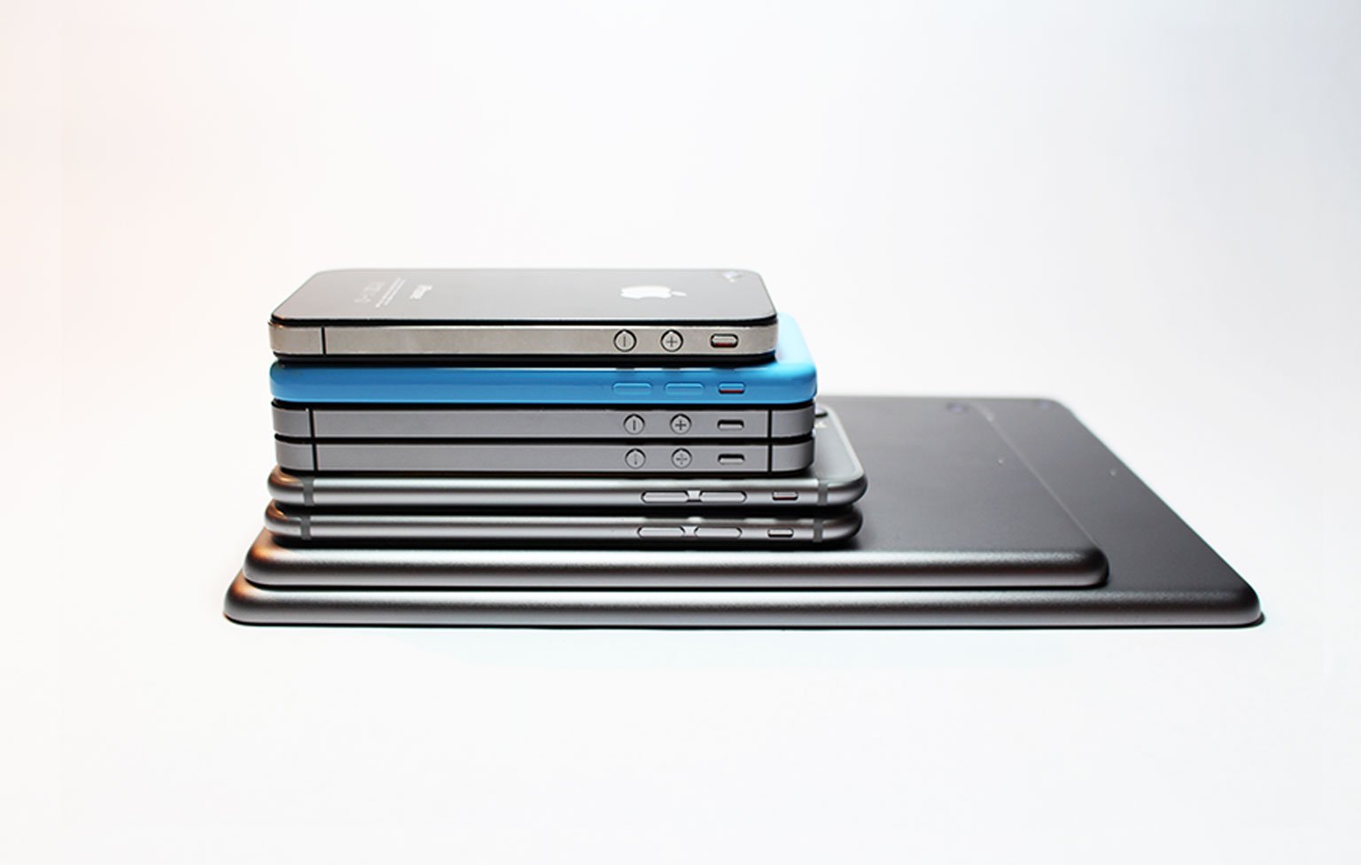
With the introduction of iOS 10 in September 2016, Apple officially dropped support for the iPhone 4s, a device introduced nearly 5 years prior in October 2011. Following this news, iOS devs rejoiced! No longer would they need to continue supporting a device that was more than 5 years old and starting to show its age in terms of processing power, features, and available hardware sensors. Most importantly, no longer would they need to continue developing UI components and layouts that needed to gracefully adapt across four different screen sizes – 3.5”, 4”, 4.7”, and 5.5” – or so they thought….
Since the iPhone 4s couldn’t run iOS 10, it was easy to view that restriction as a blessing if you were creating a new app with a deployment target of iOS 10+. The UI could now be built to take advantage of the fact that your app would only be run using the 16:9 aspect ratios of the newer devices. Previously, it had often been very challenging to keep things simple when creating UI that looked good on both the smallest 480x320 resolution of the iPhone 4s and the largest 736x414 resolution of the iPhone 7+.
As you can imagine, this was our manner of thinking until just a few weeks ago when one of our client’s iPhone-only apps got rejected by Apple. The official rejection reason was that the app didn’t run at “iPhone resolution” when reviewed on an iPad. Specifically, Apple stated that the “app didn’t display properly” and referenced some screenshots attached to the ticket showing UI elements overlapping and running into each other. They also cited section 2.4.1 of the App Store Review Guidelines, which states that “iPhone apps should run on iPad whenever possible”.
It’s easy to forget that all iPhone apps can be downloaded, installed, and run on an iPad via the iPad’s “Compatibility Mode” feature. This was something that we did test before release, but only on the large 12.9” iPad Pro. The kicker here is that for all other iPad models, the iPhone app is run in its 3:2 aspect ratio. For the 12.9” iPad Pro, the app is run at the 16:9 aspect ratio that you get when you run the app on a 4”, 4.7”, or 5.5” device.
To correct the issue, we had to pivot quickly to adapt the designs and UI layouts to function properly on the 3:2 aspect ratio device. After again testing our iPhone-only app on three different screen-sized iPhones as well as the two models of iPads, we resubmitted the build to Apple and were quickly approved.
The unfortunate lesson here is that the 3:2 aspect ratio of the ancient 3.5” iPhones will continue to be a thorn in iOS developers’ sides for years to come. Our hope is that Apple eventually allows iPhone-only apps to run at the much more developer and user-friendly 16:9 aspect ratio by default on all iPads, not just the larger 12.9” iPad Pro. If Apple ever makes this change, then we can truly stop worrying about designing for the 3:2 aspect ratio devices when supporting the latest version of iOS. Until then, continue to develop your UI for iPhone-only apps such that it runs properly on all four iPhone screen sizes.

